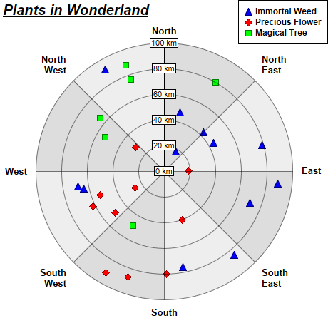
This example demonstrates how to create polar scatter charts. It also demonstrates using alternating background colors along the angular direction.
A polar scatter chart can be created as a polar line chart with data symbols. The line width is set to 0, so only the symbols can be seen. This will create the effects of a scatter chart.
The detail steps are:
Note that in this example, the polar plot area uses two alternating background colors along the angular direction. This is by using
PolarChart.setPlotAreaBg.
pythondemo\polarscatter.py
#!/usr/bin/python

# The ChartDirector for Python module is assumed to be in "../lib"
import sys, os
sys.path.insert(0, os.path.join(os.path.abspath(sys.path[0]), "..", "lib"))

from pychartdir import *

# The data for the chart
data0 = [43, 89, 76, 64, 48, 18, 92, 68, 44, 79, 71, 85]
angles0 = [45, 96, 169, 258, 15, 30, 330, 260, 60, 75, 110, 140]

data1 = [50, 91, 26, 29, 80, 53, 62, 87, 19, 40]
angles1 = [230, 210, 240, 310, 179, 250, 244, 199, 89, 160]

data2 = [88, 65, 76, 49, 80, 53]
angles2 = [340, 310, 340, 210, 30, 300]

# The labels on the angular axis (spokes)
labels = ["North", "North\nEast", "East", "South\nEast", "South", "South\nWest", "West",
    "North\nWest"]

# Create a PolarChart object of size 460 x 460 pixels
c = PolarChart(460, 460)

# Add a title to the chart at the top left corner using 15pt Arial Bold Italic font
c.addTitle2(TopLeft, "<*underline=2*>Plants in Wonderland", "Arial Bold Italic", 15)

# Set center of plot area at (230, 240) with radius 180 pixels
c.setPlotArea(230, 240, 180)

# Use alternative light grey/dark grey sector background color
c.setPlotAreaBg(0xdddddd, 0xeeeeee, 0)

# Set the grid style to circular grid
c.setGridStyle(0)

# Add a legend box at the top right corner of the chart using 9pt Arial Bold font
c.addLegend(459, 0, 1, "Arial Bold", 9).setAlignment(TopRight)

# Set angular axis as 0 - 360, either 8 spokes
c.angularAxis().setLinearScale2(0, 360, labels)

# Set the radial axis label format
c.radialAxis().setLabelFormat("{value} km")

# Add a blue (0xff) polar line layer to the chart using (data0, angle0)
layer0 = c.addLineLayer(data0, 0x0000ff, "Immortal Weed")
layer0.setAngles(angles0)

layer0.setLineWidth(0)
layer0.setDataSymbol(TriangleSymbol, 11)

# Add a red (0xff0000) polar line layer to the chart using (data1, angles1)
layer1 = c.addLineLayer(data1, 0xff0000, "Precious Flower")
layer1.setAngles(angles1)

# Disable the line by setting its width to 0, so only the symbols are visible
layer1.setLineWidth(0)

# Use a 11 pixel diamond data point symbol
layer1.setDataSymbol(DiamondSymbol, 11)

# Add a green (0x00ff00) polar line layer to the chart using (data2, angles2)
layer2 = c.addLineLayer(data2, 0x00ff00, "Magical Tree")
layer2.setAngles(angles2)

# Disable the line by setting its width to 0, so only the symbols are visible
layer2.setLineWidth(0)

# Use a 9 pixel square data point symbol
layer2.setDataSymbol(SquareSymbol, 9)

# Output the chart
c.makeChart("polarscatter.png")
© 2021 Advanced Software Engineering Limited. All rights reserved.