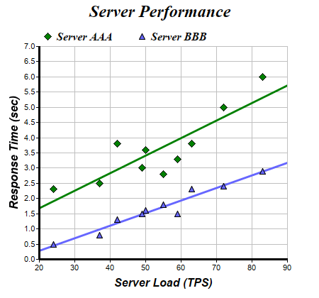
This example demonstrates linear regression trend line fitting together with scatter layers.
The chart in this example has 4 layers - 2 scatter layers created using
XYChart.addScatterLayer to show the data points, and two trend layers created using
XYChart.addTrendLayer2 for the two trend lines.
pythondemo\scattertrend.py
#!/usr/bin/python

# The ChartDirector for Python module is assumed to be in "../lib"
import sys, os
sys.path.insert(0, os.path.join(os.path.abspath(sys.path[0]), "..", "lib"))

from pychartdir import *

# The XY data of the first data series
dataX0 = [50, 55, 37, 24, 42, 49, 63, 72, 83, 59]
dataY0 = [3.6, 2.8, 2.5, 2.3, 3.8, 3.0, 3.8, 5.0, 6.0, 3.3]

# The XY data of the second data series
dataX1 = [50, 55, 37, 24, 42, 49, 63, 72, 83, 59]
dataY1 = [1.6, 1.8, 0.8, 0.5, 1.3, 1.5, 2.3, 2.4, 2.9, 1.5]

# Create a XYChart object of size 450 x 420 pixels
c = XYChart(450, 420)

# Set the plotarea at (55, 65) and of size 350 x 300 pixels, with white background and a light grey
# border (0xc0c0c0). Turn on both horizontal and vertical grid lines with light grey color
# (0xc0c0c0)
c.setPlotArea(55, 65, 350, 300, 0xffffff, -1, 0xc0c0c0, 0xc0c0c0, -1)

# Add a legend box at (50, 30) (top of the chart) with horizontal layout. Use 12pt Times Bold Italic
# font. Set the background and border color to Transparent.
c.addLegend(50, 30, 0, "Times New Roman Bold Italic", 12).setBackground(Transparent)

# Add a title to the chart using 18 point Times Bold Itatic font.
c.addTitle("Server Performance", "Times New Roman Bold Italic", 18)

# Add titles to the axes using 12pt Arial Bold Italic font
c.yAxis().setTitle("Response Time (sec)", "Arial Bold Italic", 12)
c.xAxis().setTitle("Server Load (TPS)", "Arial Bold Italic", 12)

# Set the axes line width to 3 pixels
c.yAxis().setWidth(3)
c.xAxis().setWidth(3)

# Add a scatter layer using (dataX0, dataY0)
c.addScatterLayer(dataX0, dataY0, "Server AAA", DiamondSymbol, 11, 0x008000)

# Add a trend line layer for (dataX0, dataY0)
c.addTrendLayer2(dataX0, dataY0, 0x008000).setLineWidth(3)

# Add a scatter layer for (dataX1, dataY1)
c.addScatterLayer(dataX1, dataY1, "Server BBB", TriangleSymbol, 9, 0x6666ff)

# Add a trend line layer for (dataX1, dataY1)
c.addTrendLayer2(dataX1, dataY1, 0x6666ff).setLineWidth(3)

# Output the chart
c.makeChart("scattertrend.png")
© 2021 Advanced Software Engineering Limited. All rights reserved.