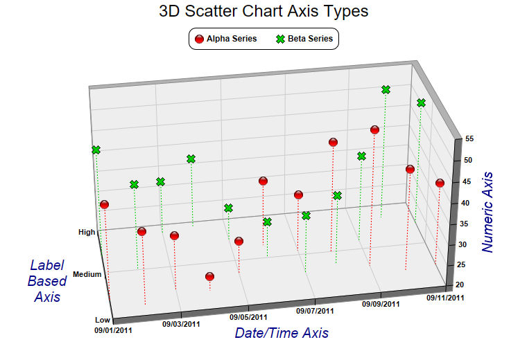
This example demonstrates different axis scale types for the 3D scatter charts. It also demonstrates using different symbol shapes.
Like an
XYChart, in a
ThreeDScatterChart, the axis scale can represent numbers, date/time or labels. In this example, the x-axis uses a date/time scale, the y-axis uses a label based scale, and the z-axis uses a numeric scale.
pythondemo\threedscatteraxis.py
#!/usr/bin/python

# The ChartDirector for Python module is assumed to be in "../lib"
import sys, os
sys.path.insert(0, os.path.join(os.path.abspath(sys.path[0]), "..", "lib"))

from pychartdir import *

# The x coordinates for the 2 scatter groups
dataX = [chartTime(2011, 9, 1), chartTime(2011, 9, 2), chartTime(2011, 9, 3), chartTime(2011, 9, 4),
    chartTime(2011, 9, 5), chartTime(2011, 9, 6), chartTime(2011, 9, 7), chartTime(2011, 9, 8),
    chartTime(2011, 9, 9), chartTime(2011, 9, 10), chartTime(2011, 9, 11)]

# The y and z coordinates for the first scatter group
dataY0 = [0.4, 0.2, 0.5, 0.4, 0.7, 1.3, 1.1, 1.0, 0.6, 0.4, 0.5]
dataZ0 = [43, 38, 33, 23.4, 28, 36, 34, 47, 53, 45, 40]

# The y and z coordinates for the second scatter group
dataY1 = [1.4, 1.0, 1.8, 1.9, 1.5, 1.0, 0.6, 0.7, 1.2, 1.7, 1.5]
dataZ1 = [46, 41, 33, 37, 28, 29, 34, 37, 41, 52, 50]

# Instead of displaying numeric values, labels are used for the y-axis
labelsY = ["Low", "Medium", "High"]

# Create a ThreeDScatterChart object of size 760 x 520 pixels
c = ThreeDScatterChart(760, 520)

# Add a title to the chart using 18 points Arial font
c.addTitle("3D Scatter Chart Axis Types", "Arial", 18)

# Set the center of the plot region at (385, 270), and set width x depth x height to 480 x 240 x 240
# pixels
c.setPlotRegion(385, 270, 480, 240, 240)

# Set the elevation and rotation angles to 30 and -10 degrees
c.setViewAngle(30, -10)

# Add a legend box at (380, 40) with horizontal layout. Use 9pt Arial Bold font.
b = c.addLegend(380, 40, 0, "Arial Bold", 9)
b.setAlignment(TopCenter)
b.setRoundedCorners()

# Add a scatter group to the chart using 13 pixels red (ff0000) glass sphere symbols, with dotted
# drop lines
g0 = c.addScatterGroup(dataX, dataY0, dataZ0, "Alpha Series", GlassSphere2Shape, 13, 0xff0000)
g0.setDropLine(c.dashLineColor(SameAsMainColor, DotLine))

# Add a scatter group to the chart using 13 pixels blue (00cc00) cross symbols, with dotted drop
# lines
g1 = c.addScatterGroup(dataX, dataY1, dataZ1, "Beta Series", Cross2Shape(), 13, 0x00cc00)
g1.setDropLine(c.dashLineColor(SameAsMainColor, DotLine))

# Set x-axis tick density to 50 pixels. ChartDirector auto-scaling will use this as the guideline
# when putting ticks on the x-axis.
c.xAxis().setTickDensity(50)

# Set the y-axis labels
c.yAxis().setLabels(labelsY)

# Set label style to Arial bold for all axes
c.xAxis().setLabelStyle("Arial Bold")
c.yAxis().setLabelStyle("Arial Bold")
c.zAxis().setLabelStyle("Arial Bold")

# Set the x, y and z axis titles using deep blue (000088) 15 points Arial font
c.xAxis().setTitle("Date/Time Axis", "Arial Italic", 15, 0x000088)
c.yAxis().setTitle("Label\nBased\nAxis", "Arial Italic", 15, 0x000088)
c.zAxis().setTitle("Numeric Axis", "Arial Italic", 15, 0x000088)

# Output the chart
c.makeChart("threedscatteraxis.png")
© 2021 Advanced Software Engineering Limited. All rights reserved.