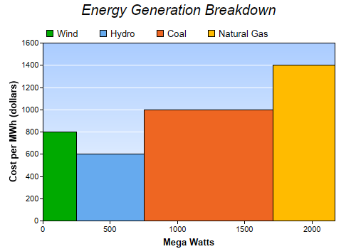
This example demonstrates a bar chart with variable bar widths.
ChartDirector does not really have a bar layer for variable width bars. However, an area layer can be used to create the same effect.
The variable width bars in this example are actually 4 areas, created by 4 area layers. The data set for each area layer consists of 4 points for the 4 corners of a bar.
pythondemo\varwidthbar.py
#!/usr/bin/python

# The ChartDirector for Python module is assumed to be in "../lib"
import sys, os
sys.path.insert(0, os.path.join(os.path.abspath(sys.path[0]), "..", "lib"))

from pychartdir import *

# The data for the chart
data = [800, 600, 1000, 1400]
widths = [250, 500, 960, 460]
labels = ["Wind", "Hydro", "Coal", "Natural Gas"]

# The colors to use
colors = [0x00aa00, 0x66aaee, 0xee6622, 0xffbb00]

# Create a XYChart object of size 500 x 350 pixels
c = XYChart(500, 350)

# Add a title to the chart using 15pt Arial Italic font
c.addTitle("Energy Generation Breakdown", "Arial Italic", 15)

# Set the plotarea at (60, 60) and of (chart_width - 90) x (chart_height - 100) in size. Use a
# vertical gradient color from light blue (f9f9ff) to sky blue (aaccff) as background. Set grid
# lines to white (ffffff).
plotAreaBgColor = c.linearGradientColor(0, 60, 0, c.getHeight() - 40, 0xaaccff, 0xf9fcff)
c.setPlotArea(60, 60, c.getWidth() - 90, c.getHeight() - 100, plotAreaBgColor, -1, -1, 0xffffff)

# Add a legend box at (50, 30) using horizontal layout and transparent background.
c.addLegend(55, 30, 0).setBackground(Transparent)

# Add titles to x/y axes with 10 points Arial Bold font
c.xAxis().setTitle("Mega Watts", "Arial Bold", 10)
c.yAxis().setTitle("Cost per MWh (dollars)", "Arial Bold", 10)

# Set the x axis rounding to false, so that the x-axis will fit the data exactly
c.xAxis().setRounding(0, 0)

# In ChartDirector, there is no bar layer that can have variable bar widths, but you may create a
# bar using an area layer. (A bar can be considered as the area under a rectangular outline.) So by
# using a loop to create one bar per area layer, we can achieve a variable width bar chart.

# starting position of current bar
currentX = 0

for i in range(0, len(data)) :
    # ending position of current bar
    nextX = currentX + widths[i]

    # outline of the bar
    dataX = [currentX, currentX, nextX, nextX]
    dataY = [0, data[i], data[i], 0]

    # create the area layer to fill the bar
    layer = c.addAreaLayer(dataY, colors[i], labels[i])
    layer.setXData(dataX)

    # the ending position becomes the starting position of the next bar
    currentX = nextX

# Output the chart
c.makeChart("varwidthbar.png")
© 2021 Advanced Software Engineering Limited. All rights reserved.