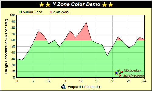
This example demonstrates using y zone colors - colors that change at certain y value thresholds.
In this example, a y zone color is used as the fill color of an area layer, so that the area fill color changes above a certain threshold.
Y zone colors are created using
Layer.yZoneColor. You can use a y zone color in any ChartDirector API that expects a color. For instance, you can use a y zone color as background color, fill color of data sets, line color, etc.
A single y zone color can support one threshold value and change between two colors. The two colors can be any colors, including another y zone color. You may create y zone colors with multiple thresholds by cascading multiple y zone colors this way.
pythondemo\yzonecolor.py
#!/usr/bin/python

# The ChartDirector for Python module is assumed to be in "../lib"
import sys, os
sys.path.insert(0, os.path.join(os.path.abspath(sys.path[0]), "..", "lib"))

from pychartdir import *

# The data for the chart
data = [30, 28, 40, 55, 75, 68, 54, 60, 50, 62, 75, 65, 75, 89, 60, 55, 53, 35, 50, 66, 56, 48, 52,
    65, 62]

# The labels for the chart
labels = ["0", "1", "2", "3", "4", "5", "6", "7", "8", "9", "10", "11", "12", "13", "14", "15",
    "16", "17", "18", "19", "20", "21", "22", "23", "24"]

# Create a XYChart object of size 500 x 300 pixels, with a pale yellow (0xffffc0) background, a
# black border, and 1 pixel 3D border effect
c = XYChart(500, 300, 0xffffc0, 0x000000, 1)

# Set the plotarea at (55, 50) and of size 420 x 205 pixels, with white background. Turn on both
# horizontal and vertical grid lines with light grey color (0xc0c0c0)
c.setPlotArea(55, 50, 420, 205, 0xffffff).setGridColor(0xc0c0c0, 0xc0c0c0)

# Add a legend box at (55, 25) (top of the chart) with horizontal layout. Use 8pt Arial font. Set
# the background and border color to Transparent.
legendBox = c.addLegend(55, 25, 0, "", 8)
legendBox.setBackground(Transparent)

# Add keys to the legend box to explain the color zones
legendBox.addKey("Normal Zone", 0x8033ff33)
legendBox.addKey("Alert Zone", 0x80ff3333)

# Add a title box to the chart using 13pt Arial Bold Italic font. The title is in CDML and includes
# embedded images for highlight. The text is white (0xffffff) on a black background, with a 1 pixel
# 3D border.
c.addTitle(
    "<*block,valign=absmiddle*><*img=star.png*><*img=star.png*> Y Zone Color Demo " \
    "<*img=star.png*><*img=star.png*><*/*>", "Arial Bold Italic", 13, 0xffffff).setBackground(
    0x000000, -1, 1)

# Add a title to the y axis
c.yAxis().setTitle("Energy Concentration (KJ per liter)")

# Set the labels on the x axis.
c.xAxis().setLabels(labels)

# Display 1 out of 3 labels on the x-axis.
c.xAxis().setLabelStep(3)

# Add a title to the x axis using CDML
c.xAxis().setTitle("<*block,valign=absmiddle*><*img=clock.png*>  Elapsed Time (hour)<*/*>")

# Set the axes width to 2 pixels
c.xAxis().setWidth(2)
c.yAxis().setWidth(2)

# Add an area layer to the chart. The area is using a y zone color, where the color is
# semi-transparent green below 60, and semi-transparent red above 60.
c.addAreaLayer(data, c.yZoneColor(60, 0x8033ff33, 0x80ff3333))

# Add a custom CDML text at the bottom right of the plot area as the logo
c.addText(475, 255,
    "<*block,valign=absmiddle*><*img=small_molecule.png*> <*block*><*font=Times New Roman Bold " \
    "Italic,size=10,color=804040*>Molecular\nEngineering<*/*>").setAlignment(BottomRight)

# Output the chart
c.makeChart("yzonecolor.png")
© 2021 Advanced Software Engineering Limited. All rights reserved.