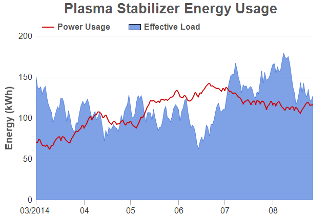
ChartDirector 6.0 (Ruby Edition)
Area Line Chart
Source Code Listing
require("chartdirector") class ArealineController < ApplicationController def index() @title = "Area Line Chart" @ctrl_file = File.expand_path(__FILE__) @noOfCharts = 1 render :template => "templates/chartview" end # # Render and deliver the chart # def getchart() # In this example, we simply use random data for the 2 data series. r = ChartDirector::RanSeries.new(127) data0 = r.getSeries(180, 70, -5, 5) data1 = r.getSeries(180, 150, -15, 15) timeStamps = r.getDateSeries(180, Time.mktime(2014, 3, 1), 86400) # Create a XYChart object of size 640 x 420 pixels c = ChartDirector::XYChart.new(640, 420) # Add a title box using grey (0x555555) 20pt Arial Bold font c.addTitle(" Plasma Stabilizer Energy Usage", "arialbd.ttf", 20, 0x555555) # Set the plotarea at (70, 70) and of size 540 x 320 pixels, with transparent background and # border and light grey (0xcccccc) horizontal grid lines c.setPlotArea(70, 70, 540, 320, -1, -1, ChartDirector::Transparent, 0xcccccc) # Add a legend box with horizontal layout above the plot area at (70, 32). Use 12pt Arial # Bold dark grey (0x555555) font, transparent background and border, and line style legend # icon. b = c.addLegend(70, 32, false, "arialbd.ttf", 12) b.setFontColor(0x555555) b.setBackground(ChartDirector::Transparent, ChartDirector::Transparent) b.setLineStyleKey() # Set axis label font to 12pt Arial c.xAxis().setLabelStyle("arial.ttf", 12) c.yAxis().setLabelStyle("arial.ttf", 12) # Set the x and y axis stems to transparent, and the x-axis tick color to grey (0xaaaaaa) c.xAxis().setColors(ChartDirector::Transparent, ChartDirector::TextColor, ChartDirector::TextColor, 0xaaaaaa) c.yAxis().setColors(ChartDirector::Transparent) # Set the major/minor tick lengths for the x-axis to 10 and 0. c.xAxis().setTickLength(10, 0) # For the automatic axis labels, set the minimum spacing to 80/40 pixels for the x/y axis. c.xAxis().setTickDensity(80) c.yAxis().setTickDensity(40) # Use "mm/yyyy" as the x-axis label format for the first plotted month of a year, and "mm" # for other months c.xAxis().setMultiFormat(ChartDirector::StartOfYearFilter(), "{value|mm/yyyy} ", ChartDirector::StartOfMonthFilter(), "{value|mm}") # Add a title to the y axis using dark grey (0x555555) 12pt Arial Bold font c.yAxis().setTitle("Energy (kWh)", "arialbd.ttf", 14, 0x555555) # Add a line layer with 2-pixel line width layer0 = c.addLineLayer(data0, 0xcc0000, "Power Usage") layer0.setXData(timeStamps) layer0.setLineWidth(2) # Add an area layer using semi-transparent blue (0x7f0044cc) as the fill color layer1 = c.addAreaLayer(data1, 0x7f0044cc, "Effective Load") layer1.setXData(timeStamps) layer1.setBorderColor(ChartDirector::SameAsMainColor) # Output the chart send_data(c.makeChart2(ChartDirector::PNG), :type => "image/png", :disposition => "inline") end end |
<html> <body style="margin:5px 0px 0px 5px"> <!-- Title --> <div style="font-size:18pt; font-family:verdana; font-weight:bold"> <%= @title %> </div> <hr style="border:solid 1px #000080" /> <!-- Source Code Listing Link --> <div style="font-size:9pt; font-family:verdana; margin-bottom:1.5em"> <%= link_to "Source Code Listing", :controller => "cddemo", :action => "viewsource", :ctrl_file => @ctrl_file, :view_file => File.expand_path(__FILE__) %> </div> <!-- Create one or more IMG tags to display the demo chart(s) --> <% 0.upto(@noOfCharts - 1) do |i| %> <img src="<%= url_for(:action => "getchart", :img => i) %>"> <% end %> </body> </html> |
#!/usr/bin/env ruby require("chartdirector") # In this example, we simply use random data for the 2 data series. r = ChartDirector::RanSeries.new(127) data0 = r.getSeries(180, 70, -5, 5) data1 = r.getSeries(180, 150, -15, 15) timeStamps = r.getDateSeries(180, Time.mktime(2014, 3, 1), 86400) # Create a XYChart object of size 640 x 420 pixels c = ChartDirector::XYChart.new(640, 420) # Add a title box using grey (0x555555) 20pt Arial Bold font c.addTitle(" Plasma Stabilizer Energy Usage", "arialbd.ttf", 20, 0x555555) # Set the plotarea at (70, 70) and of size 540 x 320 pixels, with transparent background and border # and light grey (0xcccccc) horizontal grid lines c.setPlotArea(70, 70, 540, 320, -1, -1, ChartDirector::Transparent, 0xcccccc) # Add a legend box with horizontal layout above the plot area at (70, 32). Use 12pt Arial Bold dark # grey (0x555555) font, transparent background and border, and line style legend icon. b = c.addLegend(70, 32, false, "arialbd.ttf", 12) b.setFontColor(0x555555) b.setBackground(ChartDirector::Transparent, ChartDirector::Transparent) b.setLineStyleKey() # Set axis label font to 12pt Arial c.xAxis().setLabelStyle("arial.ttf", 12) c.yAxis().setLabelStyle("arial.ttf", 12) # Set the x and y axis stems to transparent, and the x-axis tick color to grey (0xaaaaaa) c.xAxis().setColors(ChartDirector::Transparent, ChartDirector::TextColor, ChartDirector::TextColor, 0xaaaaaa) c.yAxis().setColors(ChartDirector::Transparent) # Set the major/minor tick lengths for the x-axis to 10 and 0. c.xAxis().setTickLength(10, 0) # For the automatic axis labels, set the minimum spacing to 80/40 pixels for the x/y axis. c.xAxis().setTickDensity(80) c.yAxis().setTickDensity(40) # Use "mm/yyyy" as the x-axis label format for the first plotted month of a year, and "mm" for other # months c.xAxis().setMultiFormat(ChartDirector::StartOfYearFilter(), "{value|mm/yyyy} ", ChartDirector::StartOfMonthFilter(), "{value|mm}") # Add a title to the y axis using dark grey (0x555555) 12pt Arial Bold font c.yAxis().setTitle("Energy (kWh)", "arialbd.ttf", 14, 0x555555) # Add a line layer with 2-pixel line width layer0 = c.addLineLayer(data0, 0xcc0000, "Power Usage") layer0.setXData(timeStamps) layer0.setLineWidth(2) # Add an area layer using semi-transparent blue (0x7f0044cc) as the fill color layer1 = c.addAreaLayer(data1, 0x7f0044cc, "Effective Load") layer1.setXData(timeStamps) layer1.setBorderColor(ChartDirector::SameAsMainColor) # Output the chart c.makeChart("arealine.png") |