require("chartdirector")
class BubblescaleController < ApplicationController
def index()
@title = "Bubble XY Scaling"
@ctrl_file = File.expand_path(__FILE__)
@noOfCharts = 1
render :template => "templates/chartview"
end
#
# Render and deliver the chart
#
def getchart()
# The XY points for the bubble chart. The bubble chart has independent bubble size on the X
# and Y direction.
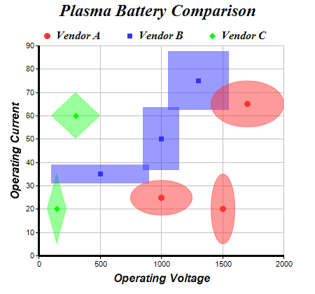
dataX0 = [1000, 1500, 1700]
dataY0 = [25, 20, 65]
dataZX0 = [500, 200, 600]
dataZY0 = [15, 30, 20]
dataX1 = [500, 1000, 1300]
dataY1 = [35, 50, 75]
dataZX1 = [800, 300, 500]
dataZY1 = [8, 27, 25]
dataX2 = [150, 300]
dataY2 = [20, 60]
dataZX2 = [160, 400]
dataZY2 = [30, 20]
# Create a XYChart object of size 450 x 420 pixels
c = ChartDirector::XYChart.new(450, 420)
# Set the plotarea at (55, 65) and of size 350 x 300 pixels, with a light grey border
# (0xc0c0c0). Turn on both horizontal and vertical grid lines with light grey color
# (0xc0c0c0)
c.setPlotArea(55, 65, 350, 300, -1, -1, 0xc0c0c0, 0xc0c0c0, -1)
# Add a legend box at (50, 30) (top of the chart) with horizontal layout. Use 12pt Times
# Bold Italic font. Set the background and border color to Transparent.
c.addLegend(50, 30, false, "timesbi.ttf", 12).setBackground(ChartDirector::Transparent)
# Add a title to the chart using 18pt Times Bold Itatic font.
c.addTitle("Plasma Battery Comparison", "timesbi.ttf", 18)
# Add titles to the axes using 12pt Arial Bold Italic font
c.yAxis().setTitle("Operating Current", "arialbi.ttf", 12)
c.xAxis().setTitle("Operating Voltage", "arialbi.ttf", 12)
# Set the axes line width to 3 pixels
c.xAxis().setWidth(3)
c.yAxis().setWidth(3)
# Add (dataX0, dataY0) as a standard scatter layer, and also as a "bubble" scatter layer,
# using circles as symbols. The "bubble" scatter layer has symbol size modulated by
# (dataZX0, dataZY0) using the scale on the x and y axes.
c.addScatterLayer(dataX0, dataY0, "Vendor A", ChartDirector::CircleSymbol, 9, 0xff3333,
0xff3333)
c.addScatterLayer(dataX0, dataY0, "", ChartDirector::CircleSymbol, 9, 0x80ff3333, 0x80ff3333
).setSymbolScale(dataZX0, ChartDirector::XAxisScale, dataZY0, ChartDirector::YAxisScale)
# Add (dataX1, dataY1) as a standard scatter layer, and also as a "bubble" scatter layer,
# using squares as symbols. The "bubble" scatter layer has symbol size modulated by
# (dataZX1, dataZY1) using the scale on the x and y axes.
c.addScatterLayer(dataX1, dataY1, "Vendor B", ChartDirector::SquareSymbol, 7, 0x3333ff,
0x3333ff)
c.addScatterLayer(dataX1, dataY1, "", ChartDirector::SquareSymbol, 9, 0x803333ff, 0x803333ff
).setSymbolScale(dataZX1, ChartDirector::XAxisScale, dataZY1, ChartDirector::YAxisScale)
# Add (dataX2, dataY2) as a standard scatter layer, and also as a "bubble" scatter layer,
# using diamonds as symbols. The "bubble" scatter layer has symbol size modulated by
# (dataZX2, dataZY2) using the scale on the x and y axes.
c.addScatterLayer(dataX2, dataY2, "Vendor C", ChartDirector::DiamondSymbol, 9, 0x00ff00,
0x00ff00)
c.addScatterLayer(dataX2, dataY2, "", ChartDirector::DiamondSymbol, 9, 0x8033ff33,
0x8033ff33).setSymbolScale(dataZX2, ChartDirector::XAxisScale, dataZY2,
ChartDirector::YAxisScale)
# Output the chart
send_data(c.makeChart2(ChartDirector::PNG), :type => "image/png", :disposition => "inline")
end
end |