require("chartdirector")
class CompactlineController < ApplicationController
def index()
@title = "Compact Line Chart"
@ctrl_file = File.expand_path(__FILE__)
@noOfCharts = 1
render :template => "templates/chartview"
end
#
# Render and deliver the chart
#
def getchart()
#
# We use a random number generator to simulate the data from 9:30am to 4:30pm with one
# data point every 4 minutes. The total number of points during that period is 106. (7
# hours x 15 points/hour + 1)
#
noOfPoints = 106
# Assume we have not reached the end of the day yet, and only 85 points are available.
# Create a random table object of 1 col x 85 rows, using 9 as seed.
rantable = ChartDirector::RanTable.new(9, 1, 85)
# Set the 1st column to start with 1800 and with random delta from -5 to 5.
rantable.setCol(0, 1800, -5, 5)
# Get the data as the 1st column of the random table
data = rantable.getCol(0)
# The x-axis labels for the chart
labels = ["-", "10am", "-", " ", "-", "12am", "-", " ", "-", "2pm", "-", " ", "-", "4pm",
"-"]
#
# Now we obtain the data into arrays, we can start to draw the chart using ChartDirector
#
# Create a XYChart object of size 180 x 180 pixels with a blue background (0x9c9cce)
c = ChartDirector::XYChart.new(180, 180, 0x9c9cce)
# Add titles to the top and bottom of the chart using 7.5pt Arial font. The text is white
# 0xffffff on a deep blue 0x31319C background.
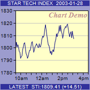
c.addTitle2(ChartDirector::Top, "STAR TECH INDEX 2003-01-28", "arial.ttf", 7.5, 0xffffff,
0x31319c)
c.addTitle2(ChartDirector::Bottom, "LATEST STI:1809.41 (+14.51)", "arial.ttf", 7.5,
0xffffff, 0x31319c)
# Set the plotarea at (31, 21) and of size 145 x 124 pixels, with a pale yellow (0xffffc8)
# background.
c.setPlotArea(31, 21, 145, 124, 0xffffc8)
# Add custom text at (176, 21) (top right corner of plotarea) using 11pt Times Bold Italic
# font/red (0xc09090) color
c.addText(176, 21, "Chart Demo", "timesbi.ttf", 11, 0xc09090).setAlignment(
ChartDirector::TopRight)
# Use 7.5pt Arial as the y axis label font
c.yAxis().setLabelStyle("", 7.5)
# Set the labels on the x axis by spreading the labels evenly between the first point (index
# = 0) and the last point (index = noOfPoints - 1)
c.xAxis().setLinearScale(0, noOfPoints - 1, labels)
# Use 7.5pt Arial as the x axis label font
c.xAxis().setLabelStyle("", 7.5)
# Add a deep blue (0x000080) line layer to the chart
c.addLineLayer(data, 0x000080)
# Output the chart
send_data(c.makeChart2(ChartDirector::PNG), :type => "image/png", :disposition => "inline")
end
end |