require("chartdirector")
class CylinderlightbarController < ApplicationController
def index()
@title = "Cylinder Bar Shading"
@ctrl_file = File.expand_path(__FILE__)
@noOfCharts = 1
render :template => "templates/chartview"
end
#
# Render and deliver the chart
#
def getchart()
# The data for the bar chart
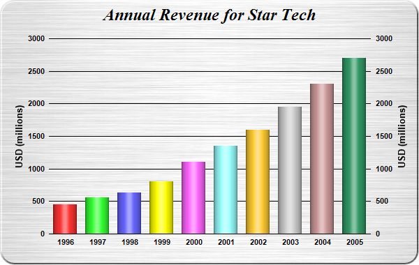
data = [450, 560, 630, 800, 1100, 1350, 1600, 1950, 2300, 2700]
# The labels for the bar chart
labels = ["1996", "1997", "1998", "1999", "2000", "2001", "2002", "2003", "2004", "2005"]
# Create a XYChart object of size 600 x 380 pixels. Set background color to brushed silver,
# with a 2 pixel 3D border. Use rounded corners of 20 pixels radius.
c = ChartDirector::XYChart.new(600, 380, ChartDirector::brushedSilverColor(),
ChartDirector::Transparent, 2)
# Add a title to the chart using 18pt Times Bold Italic font. Set top/bottom margins to 8
# pixels.
c.addTitle("Annual Revenue for Star Tech", "timesbi.ttf", 18).setMargin2(0, 0, 8, 8)
# Set the plotarea at (70, 55) and of size 460 x 280 pixels. Use transparent border and
# black grid lines. Use rounded frame with radius of 20 pixels.
c.setPlotArea(70, 55, 460, 280, -1, -1, ChartDirector::Transparent, 0x000000)
c.setRoundedFrame(0xffffff, 20)
# Add a multi-color bar chart layer using the supplied data. Set cylinder bar shape.
c.addBarLayer3(data).setBarShape(ChartDirector::CircleShape)
# Set the labels on the x axis.
c.xAxis().setLabels(labels)
# Show the same scale on the left and right y-axes
c.syncYAxis()
# Set the left y-axis and right y-axis title using 10pt Arial Bold font
c.yAxis().setTitle("USD (millions)", "arialbd.ttf", 10)
c.yAxis2().setTitle("USD (millions)", "arialbd.ttf", 10)
# Set y-axes to transparent
c.yAxis().setColors(ChartDirector::Transparent)
c.yAxis2().setColors(ChartDirector::Transparent)
# Disable ticks on the x-axis by setting the tick color to transparent
c.xAxis().setTickColor(ChartDirector::Transparent)
# Set the label styles of all axes to 8pt Arial Bold font
c.xAxis().setLabelStyle("arialbd.ttf", 8)
c.yAxis().setLabelStyle("arialbd.ttf", 8)
c.yAxis2().setLabelStyle("arialbd.ttf", 8)
# Output the chart
send_data(c.makeChart2(ChartDirector::JPG), :type => "image/jpeg", :disposition => "inline")
end
end |