require("chartdirector")
class DualyaxisController < ApplicationController
def index()
@title = "Dual Y-Axis"
@ctrl_file = File.expand_path(__FILE__)
@noOfCharts = 1
render :template => "templates/chartview"
end
#
# Render and deliver the chart
#
def getchart()
# The data for the chart
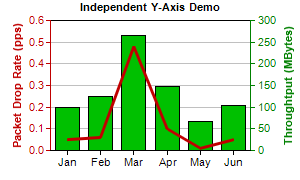
data0 = [0.05, 0.06, 0.48, 0.1, 0.01, 0.05]
data1 = [100, 125, 265, 147, 67, 105]
labels = ["Jan", "Feb", "Mar", "Apr", "May", "Jun"]
# Create a XYChart object of size 300 x 180 pixels
c = ChartDirector::XYChart.new(300, 180)
# Set the plot area at (50, 20) and of size 200 x 130 pixels
c.setPlotArea(50, 20, 200, 130)
# Add a title to the chart using 8pt Arial Bold font
c.addTitle("Independent Y-Axis Demo", "arialbd.ttf", 8)
# Set the labels on the x axis.
c.xAxis().setLabels(labels)
# Add a title to the primary (left) y axis
c.yAxis().setTitle("Packet Drop Rate (pps)")
# Set the axis, label and title colors for the primary y axis to red (0xc00000) to match the
# first data set
c.yAxis().setColors(0xc00000, 0xc00000, 0xc00000)
# Add a title to the secondary (right) y axis
c.yAxis2().setTitle("Throughtput (MBytes)")
# set the axis, label and title colors for the primary y axis to green (0x008000) to match
# the second data set
c.yAxis2().setColors(0x008000, 0x008000, 0x008000)
# Add a line layer to for the first data set using red (0xc00000) color with a line width to
# 3 pixels
c.addLineLayer(data0, 0xc00000).setLineWidth(3)
# Add a bar layer to for the second data set using green (0x00C000) color. Bind the second
# data set to the secondary (right) y axis
c.addBarLayer(data1, 0x00c000).setUseYAxis2()
# Output the chart
send_data(c.makeChart2(ChartDirector::PNG), :type => "image/png", :disposition => "inline")
end
end |