require("chartdirector")
class GradientbarController < ApplicationController
def index()
@title = "Gradient Bar Shading"
@ctrl_file = File.expand_path(__FILE__)
@noOfCharts = 1
render :template => "templates/chartview"
end
#
# Render and deliver the chart
#
def getchart()
# The data for the bar chart
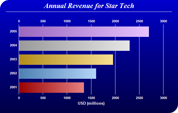
data = [1350, 1600, 1950, 2300, 2700]
# The labels for the bar chart
labels = ["2001", "2002", "2003", "2004", "2005"]
# The colors for the bars
colors = [0xcc0000, 0x66aaee, 0xeebb22, 0xcccccc, 0xcc88ff]
# Create a PieChart object of size 600 x 380 pixels.
c = ChartDirector::XYChart.new(600, 380)
# Use the white on black palette, which means the default text and line colors are white
c.setColors(ChartDirector::whiteOnBlackPalette)
# Use a vertical gradient color from blue (0000cc) to deep blue (000044) as background. Use
# rounded corners of 30 pixels radius for the top-left and bottom-right corners.
c.setBackground(c.linearGradientColor(0, 0, 0, c.getHeight(), 0x0000cc, 0x000044))
c.setRoundedFrame(0xffffff, 30, 0, 30, 0)
# Add a title using 18pt Times New Roman Bold Italic font. Add 6 pixels top and bottom
# margins to the title.
title = c.addTitle("Annual Revenue for Star Tech", "timesbi.ttf", 18)
title.setMargin2(0, 0, 6, 6)
# Add a separator line in white color just under the title
c.addLine(20, title.getHeight(), c.getWidth() - 21, title.getHeight(), 0xffffff)
# Tentatively set the plotarea at (70, 80) and of 480 x 240 pixels in size. Use transparent
# border and white grid lines
c.setPlotArea(70, 80, 480, 240, -1, -1, ChartDirector::Transparent, 0xffffff)
# Swap the axis so that the bars are drawn horizontally
c.swapXY()
# Add a multi-color bar chart layer using the supplied data. Use bar gradient lighting with
# the light intensity from 0.75 to 2.0
c.addBarLayer3(data, colors).setBorderColor(ChartDirector::Transparent,
ChartDirector::barLighting(0.75, 2.0))
# Set the labels on the x axis.
c.xAxis().setLabels(labels)
# Show the same scale on the left and right y-axes
c.syncYAxis()
# Set the bottom y-axis title using 10pt Arial Bold font
c.yAxis().setTitle("USD (millions)", "arialbd.ttf", 10)
# Set y-axes to transparent
c.yAxis().setColors(ChartDirector::Transparent)
c.yAxis2().setColors(ChartDirector::Transparent)
# Disable ticks on the x-axis by setting the tick color to transparent
c.xAxis().setTickColor(ChartDirector::Transparent)
# Set the label styles of all axes to 8pt Arial Bold font
c.xAxis().setLabelStyle("arialbd.ttf", 8)
c.yAxis().setLabelStyle("arialbd.ttf", 8)
c.yAxis2().setLabelStyle("arialbd.ttf", 8)
# Adjust the plot area size, such that the bounding box (inclusive of axes) is 30 pixels
# from the left edge, 25 pixels below the title, 50 pixels from the right edge, and 25
# pixels from the bottom edge.
c.packPlotArea(30, title.getHeight() + 25, c.getWidth() - 50, c.getHeight() - 25)
# Output the chart
send_data(c.makeChart2(ChartDirector::PNG), :type => "image/png", :disposition => "inline")
end
end |