require("chartdirector")
class MarkzoneController < ApplicationController
def index()
@title = "Marks and Zones (1)"
@ctrl_file = File.expand_path(__FILE__)
@noOfCharts = 1
render :template => "templates/chartview"
end
#
# Render and deliver the chart
#
def getchart()
# The data for the chart
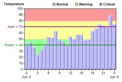
data = [40, 45, 37, 24, 32, 39, 53, 52, 63, 49, 46, 40, 54, 50, 57, 57, 48, 49, 63, 67, 74,
72, 70, 89, 74]
labels = ["0\nJun 4", "1", "2", "3", "4", "5", "6", "7", "8", "9", "10", "11", "12", "13",
"14", "15", "16", "17", "18", "19", "20", "21", "22", "23", "0\nJun 5"]
# Create a XYChart object of size 400 x 270 pixels
c = ChartDirector::XYChart.new(400, 270)
# Set the plotarea at (80, 60) and of size 300 x 200 pixels. Turn off the grid lines by
# setting their colors to Transparent.
c.setPlotArea(80, 28, 300, 200).setGridColor(ChartDirector::Transparent)
# Add a title to the y axis
textbox = c.yAxis().setTitle("Temperature")
# Set the y axis title upright (font angle = 0)
textbox.setFontAngle(0)
# Put the y axis title on top of the axis
textbox.setAlignment(ChartDirector::TopLeft2)
# Add green (0x99ff99), yellow (0xffff99) and red (0xff9999) zones to the y axis to
# represent the ranges 0 - 50, 50 - 80, and 80 - max.
c.yAxis().addZone(0, 50, 0x99ff99)
c.yAxis().addZone(50, 80, 0xffff99)
c.yAxis().addZone(80, 9999, 0xff9999)
# Add a purple (0x800080) mark at y = 70 using a line width of 2.
c.yAxis().addMark(70, 0x800080, "Alert = 70").setLineWidth(2)
# Add a green (0x008000) mark at y = 40 using a line width of 2.
c.yAxis().addMark(40, 0x008000, "Watch = 40").setLineWidth(2)
# Add a legend box at (165, 0) (top right of the chart) using 8pt Arial font. and horizontal
# layout.
legend = c.addLegend(165, 0, false, "arialbd.ttf", 8)
# Disable the legend box boundary by setting the colors to Transparent
legend.setBackground(ChartDirector::Transparent, ChartDirector::Transparent)
# Add 3 custom entries to the legend box to represent the 3 zones
legend.addKey("Normal", 0x80ff80)
legend.addKey("Warning", 0xffff80)
legend.addKey("Critical", 0xff8080)
# Set the labels on the x axis.
c.xAxis().setLabels(labels)
# Display 1 out of 3 labels on the x-axis. Show minor ticks for remaining labels.
c.xAxis().setLabelStep(3, 1)
# Add a 3D bar layer with the given data
layer = c.addBarLayer(data, 0xbbbbff)
# Set the bar gap to 0 so that the bars are packed tightly
layer.setBarGap(0)
# Set the border color of the bars same as the fill color, with 1 pixel 3D border effect.
layer.setBorderColor(ChartDirector::SameAsMainColor, 1)
# Output the chart
send_data(c.makeChart2(ChartDirector::PNG), :type => "image/png", :disposition => "inline")
end
end |