ChartDirector 6.0 (Ruby Edition)
Multiple Axes
Source Code Listing
require("chartdirector") class MultiaxesController < ApplicationController def index() 
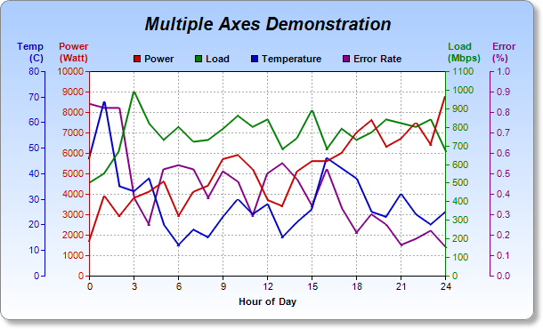
@title = "Multiple Axes" @ctrl_file = File.expand_path(__FILE__) @noOfCharts = 1 render :template => "templates/chartview" end # # Render and deliver the chart # def getchart() # Data for the chart data0 = [1700, 3900, 2900, 3800, 4100, 4600, 2900, 4100, 4400, 5700, 5900, 5200, 3700, 3400, 5100, 5600, 5600, 6000, 7000, 7600, 6300, 6700, 7500, 6400, 8800] data1 = [500, 550, 670, 990, 820, 730, 800, 720, 730, 790, 860, 800, 840, 680, 740, 890, 680, 790, 730, 770, 840, 820, 800, 840, 670] data2 = [46, 68, 35, 33, 38, 20, 12, 18, 15, 23, 30, 24, 28, 15, 21, 26, 46, 42, 38, 25, 23, 32, 24, 20, 25] data3 = [0.84, 0.82, 0.82, 0.38, 0.25, 0.52, 0.54, 0.52, 0.38, 0.51, 0.46, 0.29, 0.5, 0.55, 0.47, 0.34, 0.52, 0.33, 0.21, 0.3, 0.25, 0.15, 0.18, 0.22, 0.14] # Labels for the chart labels = ["0", "1", "2", "3", "4", "5", "6", "7", "8", "9", "10", "11", "12", "13", "14", "15", "16", "17", "18", "19", "20", "21", "22", "23", "24"] # Create a XYChart object of size 600 x 360 pixels. Use a vertical gradient color from sky # blue (aaccff) to white (ffffff) as background. Set border to grey (888888). Use rounded # corners. Enable soft drop shadow. c = ChartDirector::XYChart.new(600, 360) c.setBackground(c.linearGradientColor(0, 0, 0, c.getHeight(), 0xaaccff, 0xffffff), 0x888888) c.setRoundedFrame() c.setDropShadow() # Add a title box to the chart using 15pt Arial Bold Italic font. Set top margin to 16 # pixels. title = c.addTitle("Multiple Axes Demonstration", "arialbi.ttf", 15) title.setMargin2(0, 0, 16, 0) # Set the plotarea at (100, 80) and of size 400 x 230 pixels, with white (ffffff) # background. Use grey #(aaaaa) dotted lines for both horizontal and vertical grid lines. c.setPlotArea(100, 80, 400, 230, 0xffffff, -1, -1, c.dashLineColor(0xaaaaaa, ChartDirector::DotLine), -1) # Add a legend box with the bottom center anchored at (300, 80) (top center of the plot # area). Use horizontal layout, and 8 points Arial Bold font. Set background and border to # transparent. legendBox = c.addLegend(300, 80, false, "arialbd.ttf", 8) legendBox.setAlignment(ChartDirector::BottomCenter) legendBox.setBackground(ChartDirector::Transparent, ChartDirector::Transparent) # Set the labels on the x axis. c.xAxis().setLabels(labels) # Display 1 out of 3 labels on the x-axis. c.xAxis().setLabelStep(3) # Add a title to the x-axis c.xAxis().setTitle("Hour of Day") # Add a title on top of the primary (left) y axis. c.yAxis().setTitle("Power\n(Watt)").setAlignment(ChartDirector::TopLeft2) # Set the axis, label and title colors for the primary y axis to red (c00000) to match the # first data set c.yAxis().setColors(0xcc0000, 0xcc0000, 0xcc0000) # Add a title on top of the secondary (right) y axis. c.yAxis2().setTitle("Load\n(Mbps)").setAlignment(ChartDirector::TopRight2) # Set the axis, label and title colors for the secondary y axis to green (00800000) to match # the second data set c.yAxis2().setColors(0x008000, 0x008000, 0x008000) # Add the third y-axis at 50 pixels to the left of the plot area leftAxis = c.addAxis(ChartDirector::Left, 50) # Add a title on top of the third y axis. leftAxis.setTitle("Temp\n(C)").setAlignment(ChartDirector::TopLeft2) # Set the axis, label and title colors for the third y axis to blue (0000cc) to match the # third data set leftAxis.setColors(0x0000cc, 0x0000cc, 0x0000cc) # Add the fouth y-axis at 50 pixels to the right of the plot area rightAxis = c.addAxis(ChartDirector::Right, 50) # Add a title on top of the fourth y axis. rightAxis.setTitle("Error\n(%)").setAlignment(ChartDirector::TopRight2) # Set the axis, label and title colors for the fourth y axis to purple (880088) to match the # fourth data set rightAxis.setColors(0x880088, 0x880088, 0x880088) # Add a line layer to for the first data set using red (c00000) color, with a line width of # 2 pixels layer0 = c.addLineLayer(data0, 0xcc0000, "Power") layer0.setLineWidth(2) # Add a line layer to for the second data set using green (00c0000) color, with a line width # of 2 pixels. Bind the layer to the secondary y-axis. layer1 = c.addLineLayer(data1, 0x008000, "Load") layer1.setLineWidth(2) layer1.setUseYAxis2() # Add a line layer to for the third data set using blue (0000cc) color, with a line width of # 2 pixels. Bind the layer to the third y-axis. layer2 = c.addLineLayer(data2, 0x0000cc, "Temperature") layer2.setLineWidth(2) layer2.setUseYAxis(leftAxis) # Add a line layer to for the fourth data set using purple (880088) color, with a line width # of 2 pixels. Bind the layer to the fourth y-axis. layer3 = c.addLineLayer(data3, 0x880088, "Error Rate") layer3.setLineWidth(2) layer3.setUseYAxis(rightAxis) # Output the chart send_data(c.makeChart2(ChartDirector::PNG), :type => "image/png", :disposition => "inline") end end |
<html> <body style="margin:5px 0px 0px 5px"> <!-- Title --> <div style="font-size:18pt; font-family:verdana; font-weight:bold"> <%= @title %> </div> <hr style="border:solid 1px #000080" /> <!-- Source Code Listing Link --> <div style="font-size:9pt; font-family:verdana; margin-bottom:1.5em"> <%= link_to "Source Code Listing", :controller => "cddemo", :action => "viewsource", :ctrl_file => @ctrl_file, :view_file => File.expand_path(__FILE__) %> </div> <!-- Create one or more IMG tags to display the demo chart(s) --> <% 0.upto(@noOfCharts - 1) do |i| %> <img src="<%= url_for(:action => "getchart", :img => i) %>"> <% end %> </body> </html> |
#!/usr/bin/env ruby require("chartdirector") # Data for the chart data0 = [1700, 3900, 2900, 3800, 4100, 4600, 2900, 4100, 4400, 5700, 5900, 5200, 3700, 3400, 5100, 5600, 5600, 6000, 7000, 7600, 6300, 6700, 7500, 6400, 8800] data1 = [500, 550, 670, 990, 820, 730, 800, 720, 730, 790, 860, 800, 840, 680, 740, 890, 680, 790, 730, 770, 840, 820, 800, 840, 670] data2 = [46, 68, 35, 33, 38, 20, 12, 18, 15, 23, 30, 24, 28, 15, 21, 26, 46, 42, 38, 25, 23, 32, 24, 20, 25] data3 = [0.84, 0.82, 0.82, 0.38, 0.25, 0.52, 0.54, 0.52, 0.38, 0.51, 0.46, 0.29, 0.5, 0.55, 0.47, 0.34, 0.52, 0.33, 0.21, 0.3, 0.25, 0.15, 0.18, 0.22, 0.14] # Labels for the chart labels = ["0", "1", "2", "3", "4", "5", "6", "7", "8", "9", "10", "11", "12", "13", "14", "15", "16", "17", "18", "19", "20", "21", "22", "23", "24"] # Create a XYChart object of size 600 x 360 pixels. Use a vertical gradient color from sky blue # (aaccff) to white (ffffff) as background. Set border to grey (888888). Use rounded corners. Enable # soft drop shadow. c = ChartDirector::XYChart.new(600, 360) c.setBackground(c.linearGradientColor(0, 0, 0, c.getHeight(), 0xaaccff, 0xffffff), 0x888888) c.setRoundedFrame() c.setDropShadow() # Add a title box to the chart using 15pt Arial Bold Italic font. Set top margin to 16 pixels. title = c.addTitle("Multiple Axes Demonstration", "arialbi.ttf", 15) title.setMargin2(0, 0, 16, 0) # Set the plotarea at (100, 80) and of size 400 x 230 pixels, with white (ffffff) background. Use # grey #(aaaaa) dotted lines for both horizontal and vertical grid lines. c.setPlotArea(100, 80, 400, 230, 0xffffff, -1, -1, c.dashLineColor(0xaaaaaa, ChartDirector::DotLine ), -1) # Add a legend box with the bottom center anchored at (300, 80) (top center of the plot area). Use # horizontal layout, and 8 points Arial Bold font. Set background and border to transparent. legendBox = c.addLegend(300, 80, false, "arialbd.ttf", 8) legendBox.setAlignment(ChartDirector::BottomCenter) legendBox.setBackground(ChartDirector::Transparent, ChartDirector::Transparent) # Set the labels on the x axis. c.xAxis().setLabels(labels) # Display 1 out of 3 labels on the x-axis. c.xAxis().setLabelStep(3) # Add a title to the x-axis c.xAxis().setTitle("Hour of Day") # Add a title on top of the primary (left) y axis. c.yAxis().setTitle("Power\n(Watt)").setAlignment(ChartDirector::TopLeft2) # Set the axis, label and title colors for the primary y axis to red (c00000) to match the first # data set c.yAxis().setColors(0xcc0000, 0xcc0000, 0xcc0000) # Add a title on top of the secondary (right) y axis. c.yAxis2().setTitle("Load\n(Mbps)").setAlignment(ChartDirector::TopRight2) # Set the axis, label and title colors for the secondary y axis to green (00800000) to match the # second data set c.yAxis2().setColors(0x008000, 0x008000, 0x008000) # Add the third y-axis at 50 pixels to the left of the plot area leftAxis = c.addAxis(ChartDirector::Left, 50) # Add a title on top of the third y axis. leftAxis.setTitle("Temp\n(C)").setAlignment(ChartDirector::TopLeft2) # Set the axis, label and title colors for the third y axis to blue (0000cc) to match the third data # set leftAxis.setColors(0x0000cc, 0x0000cc, 0x0000cc) # Add the fouth y-axis at 50 pixels to the right of the plot area rightAxis = c.addAxis(ChartDirector::Right, 50) # Add a title on top of the fourth y axis. rightAxis.setTitle("Error\n(%)").setAlignment(ChartDirector::TopRight2) # Set the axis, label and title colors for the fourth y axis to purple (880088) to match the fourth # data set rightAxis.setColors(0x880088, 0x880088, 0x880088) # Add a line layer to for the first data set using red (c00000) color, with a line width of 2 pixels layer0 = c.addLineLayer(data0, 0xcc0000, "Power") layer0.setLineWidth(2) # Add a line layer to for the second data set using green (00c0000) color, with a line width of 2 # pixels. Bind the layer to the secondary y-axis. layer1 = c.addLineLayer(data1, 0x008000, "Load") layer1.setLineWidth(2) layer1.setUseYAxis2() # Add a line layer to for the third data set using blue (0000cc) color, with a line width of 2 # pixels. Bind the layer to the third y-axis. layer2 = c.addLineLayer(data2, 0x0000cc, "Temperature") layer2.setLineWidth(2) layer2.setUseYAxis(leftAxis) # Add a line layer to for the fourth data set using purple (880088) color, with a line width of 2 # pixels. Bind the layer to the fourth y-axis. layer3 = c.addLineLayer(data3, 0x880088, "Error Rate") layer3.setLineWidth(2) layer3.setUseYAxis(rightAxis) # Output the chart c.makeChart("multiaxes.png") |