require("chartdirector")
class MulticylinderController < ApplicationController
def index()
@title = "Multi-Cylinder Chart"
@ctrl_file = File.expand_path(__FILE__)
@noOfCharts = 1
render :template => "templates/chartview"
end
#
# Render and deliver the chart
#
def getchart()
# Data for the chart
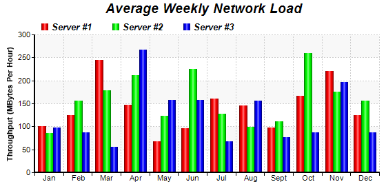
data0 = [100, 125, 245, 147, 67, 96, 160, 145, 97, 167, 220, 125]
data1 = [85, 156, 179, 211, 123, 225, 127, 99, 111, 260, 175, 156]
data2 = [97, 87, 56, 267, 157, 157, 67, 156, 77, 87, 197, 87]
labels = ["Jan", "Feb", "Mar", "Apr", "May", "Jun", "Jul", "Aug", "Sept", "Oct", "Nov",
"Dec"]
# Create a XYChart object of size 560 x 280 pixels.
c = ChartDirector::XYChart.new(560, 280)
# Add a title to the chart using 14pt Arial Bold Italic font
c.addTitle(" Average Weekly Network Load", "arialbi.ttf", 14)
# Set the plotarea at (50, 50) and of 500 x 200 pixels in size. Use alternating light grey
# (f8f8f8) / white (ffffff) background. Set border to transparent and use grey (CCCCCC)
# dotted lines as horizontal and vertical grid lines
c.setPlotArea(50, 50, 500, 200, 0xffffff, 0xf8f8f8, ChartDirector::Transparent,
c.dashLineColor(0xcccccc, ChartDirector::DotLine), c.dashLineColor(0xcccccc,
ChartDirector::DotLine))
# Add a legend box at (50, 22) using horizontal layout. Use 10 pt Arial Bold Italic font,
# with transparent background
c.addLegend(50, 22, false, "arialbi.ttf", 10).setBackground(ChartDirector::Transparent)
# Set the x axis labels
c.xAxis().setLabels(labels)
# Draw the ticks between label positions (instead of at label positions)
c.xAxis().setTickOffset(0.5)
# Add axis title
c.yAxis().setTitle("Throughput (MBytes Per Hour)")
# Set axis line width to 2 pixels
c.xAxis().setWidth(2)
c.yAxis().setWidth(2)
# Add a multi-bar layer with 3 data sets
layer = c.addBarLayer2(ChartDirector::Side)
layer.addDataSet(data0, 0xff0000, "Server #1")
layer.addDataSet(data1, 0x00ff00, "Server #2")
layer.addDataSet(data2, 0x0000ff, "Server #3")
# Set bar shape to circular (cylinder)
layer.setBarShape(ChartDirector::CircleShape)
# Configure the bars within a group to touch each others (no gap)
layer.setBarGap(0.2, ChartDirector::TouchBar)
# Output the chart
send_data(c.makeChart2(ChartDirector::PNG), :type => "image/png", :disposition => "inline")
end
end |