require("chartdirector")
class TrendlineController < ApplicationController
def index()
@title = "Trend Line Chart"
@ctrl_file = File.expand_path(__FILE__)
@noOfCharts = 1
render :template => "templates/chartview"
end
#
# Render and deliver the chart
#
def getchart()
# The data for the line chart
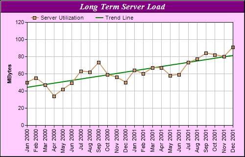
data = [50, 55, 47, 34, 42, 49, 63, 62, 73, 59, 56, 50, 64, 60, 67, 67, 58, 59, 73, 77, 84,
82, 80, 91]
# The labels for the line chart
labels = ["Jan 2000", "Feb 2000", "Mar 2000", "Apr 2000", "May 2000", "Jun 2000",
"Jul 2000", "Aug 2000", "Sep 2000", "Oct 2000", "Nov 2000", "Dec 2000", "Jan 2001",
"Feb 2001", "Mar 2001", "Apr 2001", "May 2001", "Jun 2001", "Jul 2001", "Aug 2001",
"Sep 2001", "Oct 2001", "Nov 2001", "Dec 2001"]
# Create a XYChart object of size 500 x 320 pixels, with a pale purpule (0xffccff)
# background, a black border, and 1 pixel 3D border effect.
c = ChartDirector::XYChart.new(500, 320, 0xffccff, 0x000000, 1)
# Set the plotarea at (55, 45) and of size 420 x 210 pixels, with white background. Turn on
# both horizontal and vertical grid lines with light grey color (0xc0c0c0)
c.setPlotArea(55, 45, 420, 210, 0xffffff, -1, -1, 0xc0c0c0, -1)
# Add a legend box at (55, 25) (top of the chart) with horizontal layout. Use 8pt Arial
# font. Set the background and border color to Transparent.
c.addLegend(55, 22, false, "", 8).setBackground(ChartDirector::Transparent)
# Add a title box to the chart using 13pt Times Bold Italic font. The text is white
# (0xffffff) on a purple (0x800080) background, with a 1 pixel 3D border.
c.addTitle("Long Term Server Load", "timesbi.ttf", 13, 0xffffff).setBackground(0x800080, -1,
1)
# Add a title to the y axis
c.yAxis().setTitle("MBytes")
# Set the labels on the x axis. Rotate the font by 90 degrees.
c.xAxis().setLabels(labels).setFontAngle(90)
# Add a line layer to the chart
lineLayer = c.addLineLayer()
# Add the data to the line layer using light brown color (0xcc9966) with a 7 pixel square
# symbol
lineLayer.addDataSet(data, 0xcc9966, "Server Utilization").setDataSymbol(
ChartDirector::SquareSymbol, 7)
# Set the line width to 2 pixels
lineLayer.setLineWidth(2)
# Add a trend line layer using the same data with a dark green (0x008000) color. Set the
# line width to 2 pixels
c.addTrendLayer(data, 0x008000, "Trend Line").setLineWidth(2)
# Output the chart
send_data(c.makeChart2(ChartDirector::PNG), :type => "image/png", :disposition => "inline")
end
end |