require("chartdirector")
class ZoomscrolltrackController < ApplicationController
include ChartDirector::InteractiveChartSupport
private
#
# Initialize the WebChartViewer when the page is first loaded
#
def initViewer(viewer)
# The full x-axis range is from Jan 1, 2007 to Jan 1, 2012
startDate = Time.mktime(2010, 1, 1)
endDate = Time.mktime(2015, 1, 1)
viewer.setFullRange("x", startDate, endDate)
# Initialize the view port to show the last 366 days (out of 1826 days)
viewer.setViewPortWidth(366.0 / 1826)
viewer.setViewPortLeft(1 - viewer.getViewPortWidth())
# Set the maximum zoom to 10 days (out of 1826 days)
viewer.setZoomInWidthLimit(10.0 / 1826)
end
#
# Create a random table for demo purpose.
#
def getRandomTable()
r = ChartDirector::RanTable.new(127, 4, 1828)
r.setDateCol(0, Time.mktime(2010, 1, 1), 86400)
r.setCol(1, 150, -10, 10)
r.setCol(2, 200, -10, 10)
r.setCol(3, 250, -8, 8)
return r
end
#
# Draw the chart
#
def drawChart(viewer)
# Determine the visible x-axis range
viewPortStartDate = viewer.getValueAtViewPort("x", viewer.getViewPortLeft())
viewPortEndDate = viewer.getValueAtViewPort("x", viewer.getViewPortLeft(
) + viewer.getViewPortWidth())
# We need to get the data within the visible x-axis range. In real code, this can be by
# using a database query or some other means as specific to the application. In this demo,
# we just generate a random data table, and then select the data within the table.
r = getRandomTable()
# Select the data for the visible date range viewPortStartDate to viewPortEndDate. It is
# possible there is no data point at exactly viewPortStartDate or viewPortEndDate. In this
# case, we also need the data points that are just outside the visible date range to
# "overdraw" the line a little bit (the "overdrawn" part will be clipped to the plot area)
# In this demo, we do this by adding a one day margin to the date range when selecting the
# data.
r.selectDate(0, viewPortStartDate - 86400, viewPortEndDate + 86400)
# The selected data from the random data table
timeStamps = r.getCol(0)
dataSeriesA = r.getCol(1)
dataSeriesB = r.getCol(2)
dataSeriesC = r.getCol(3)
#
# Now we have obtained the data, we can plot the chart.
#
#================================================================================
# Configure overall chart appearance.
#================================================================================
# Create an XYChart object of size 640 x 350 pixels
c = ChartDirector::XYChart.new(640, 350)
# Set the plotarea at (55, 55) with width 80 pixels less than chart width, and height 90
# pixels less than chart height. Use a vertical gradient from light blue (f0f6ff) to sky
# blue (a0c0ff) as background. Set border to transparent and grid lines to white (ffffff).
c.setPlotArea(55, 55, c.getWidth() - 80, c.getHeight() - 90, c.linearGradientColor(0, 55, 0,
c.getHeight() - 35, 0xf0f6ff, 0xa0c0ff), -1, ChartDirector::Transparent, 0xffffff,
0xffffff)
# As the data can lie outside the plotarea in a zoomed chart, we need to enable clipping.
c.setClipping()
# Add a title to the chart using 18pt Times New Roman Bold Italic font
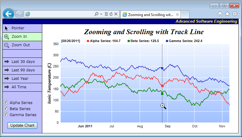
c.addTitle(" Zooming and Scrolling with Track Line", "timesbi.ttf", 18)
# Set the axis stem to transparent
c.xAxis().setColors(ChartDirector::Transparent)
c.yAxis().setColors(ChartDirector::Transparent)
# Add axis title using 10pt Arial Bold Italic font
c.yAxis().setTitle("Ionic Temperature (C)", "arialbi.ttf", 10)
#================================================================================
# Add data to chart
#================================================================================
#
# In this example, we represent the data by lines. You may modify the code below to use
# other layer types (areas, scatter plot, etc).
#
# Add a line layer for the lines, using a line width of 2 pixels
layer = c.addLineLayer2()
layer.setLineWidth(2)
# In this demo, we do not have too many data points. In real code, the chart may contain a
# lot of data points when fully zoomed out - much more than the number of horizontal pixels
# in this plot area. So it is a good idea to use fast line mode.
layer.setFastLineMode()
# Add up to 3 data series to a line layer, depending on whether the user has selected the
# data series.
layer.setXData(timeStamps)
if viewer.getCustomAttr("data0CheckBox") != "F"
layer.addDataSet(dataSeriesA, 0xff3333, "Alpha Series")
end
if viewer.getCustomAttr("data1CheckBox") != "F"
layer.addDataSet(dataSeriesB, 0x008800, "Beta Series")
end
if viewer.getCustomAttr("data2CheckBox") != "F"
layer.addDataSet(dataSeriesC, 0x3333cc, "Gamma Series")
end
#================================================================================
# Configure axis scale and labelling
#================================================================================
# Set the x-axis as a date/time axis with the scale according to the view port x range.
viewer.syncDateAxisWithViewPort("x", c.xAxis())
#
# In this demo, the time range can be from a few years to a few days. We demonstrate how to
# set up different date/time format based on the time range.
#
# If all ticks are yearly aligned, then we use "yyyy" as the label format.
c.xAxis().setFormatCondition("align", 360 * 86400)
c.xAxis().setLabelFormat("{value|yyyy}")
# If all ticks are monthly aligned, then we use "mmm yyyy" in bold font as the first label
# of a year, and "mmm" for other labels.
c.xAxis().setFormatCondition("align", 30 * 86400)
c.xAxis().setMultiFormat(ChartDirector::StartOfYearFilter(),
"<*font=bold*>{value|mmm yyyy}", ChartDirector::AllPassFilter(), "{value|mmm}")
# If all ticks are daily algined, then we use "mmm dd<*br*>yyyy" in bold font as the first
# label of a year, and "mmm dd" in bold font as the first label of a month, and "dd" for
# other labels.
c.xAxis().setFormatCondition("align", 86400)
c.xAxis().setMultiFormat(ChartDirector::StartOfYearFilter(),
"<*block,halign=left*><*font=bold*>{value|mmm dd<*br*>yyyy}",
ChartDirector::StartOfMonthFilter(), "<*font=bold*>{value|mmm dd}")
c.xAxis().setMultiFormat2(ChartDirector::AllPassFilter(), "{value|dd}")
# For all other cases (sub-daily ticks), use "hh:nn<*br*>mmm dd" for the first label of a
# day, and "hh:nn" for other labels.
c.xAxis().setFormatCondition("else")
c.xAxis().setMultiFormat(ChartDirector::StartOfDayFilter(),
"<*font=bold*>{value|hh:nn<*br*>mmm dd}", ChartDirector::AllPassFilter(),
"{value|hh:nn}")
#================================================================================
# Step 5 - Output the chart
#================================================================================
# Create the image and save it in a session variable
session[viewer.getId()] = c.makeChart2(ChartDirector::PNG)
# Set the chart URL to the viewer
viewer.setImageUrl(url_for(:action => "get_session_data", :id => viewer.getId(),
:nocache => rand))
# Output Javascript chart model to the browser to support tracking cursor
viewer.setChartModel(c.getJsChartModel())
end
public
def index()
#
# This script handles both the full page request, as well as the subsequent partial updates
# (AJAX chart updates). We need to determine the type of request first before we processing
# it.
#
# Create the WebChartViewer object
@viewer = ChartDirector::WebChartViewer.new(request, "chart1")
if @viewer.isPartialUpdateRequest()
# Is a partial update request. Draw the chart and perform a partial response.
drawChart(@viewer)
send_data(@viewer.partialUpdateChart(), :type => "text/html; charset=utf-8",
:disposition => "inline")
return
end
#
# If the code reaches here, it is a full page request.
#
# In this exapmle, we just need to initialize the WebChartViewer and draw the chart.
initViewer(@viewer)
drawChart(@viewer)
end
end |